
Spot price charts are the heartbeat of trading. Whether you're watching Bitcoin, Ethereum, or Apple stock, these charts show you what’s really happening in the market - not what someone says is happening. They don’t care about news headlines, earnings reports, or Twitter hype. They only care about price. And if you can learn to read them, you’ll start seeing opportunities others miss.
What Spot Price Charts Actually Show
A spot price chart is just a visual record of how an asset’s price moved over time. Every single trade that happened gets recorded. The chart doesn’t lie. It doesn’t guess. It just shows you the raw truth: where price opened, where it closed, what the highest and lowest points were during that time.
Every time period - whether it’s one minute, one hour, or one day - gives you four key numbers:
- Open: The price when the period started
- Close: The price when the period ended
- High: The highest price reached
- Low: The lowest price reached
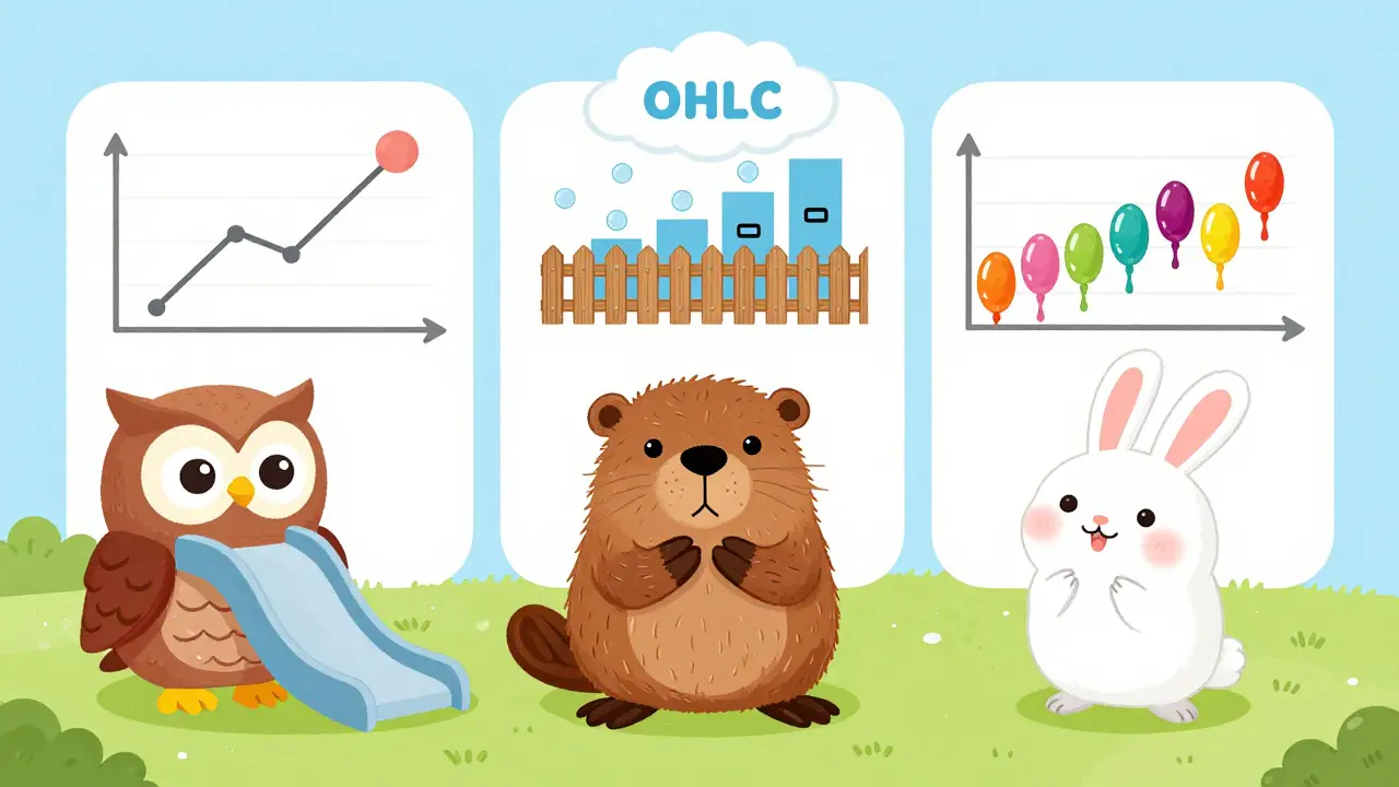
This is called OHLC data. And if you understand it, you’re already ahead of 80% of retail traders who just stare at the line and guess.
The Three Types of Charts You Need to Know
Not all charts are made the same. There are three main types, and each one tells a different story.
Line Charts - The Simplest
Line charts connect only the closing prices. That’s it. No highs, no lows, no opens. Just the end price of each period.
They’re great for seeing long-term trends. If you’re holding Bitcoin for six months and want to know if it’s generally going up or down, a line chart is clean and easy. But if you’re trying to time a trade? Forget it. You’re blind to volatility. You won’t see the 15% drop that happened before the close. That’s why only 41% of beginners use them - and why pros rarely do.
Bar Charts - The Complete Picture
Bar charts show all four data points. A vertical line runs from the low to the high. A small horizontal tick on the left marks the open. A tick on the right marks the close.
This gives you way more detail than a line chart. You can see if the price opened near the low and closed near the high - that’s bullish. Or if it opened near the high and closed near the low - that’s bearish. Professionals like bar charts because they’re compact and don’t distract. About 33% of active traders use them, especially in futures markets like those on the CME Group.
Candlestick Charts - The Most Powerful
Candlesticks are the gold standard. They came from Japanese rice traders in the 1700s. And they’re still the most used chart type today - 78% of active traders rely on them, according to NewTrading.io’s 2023 survey.
Here’s how they work:
- The body is the rectangle between open and close
- The wicks (or shadows) stretch out to show high and low
- Green (or white) = price closed higher than it opened
- Red (or black) = price closed lower than it opened
The size of the body tells you how strong the move was. A long green body? Buyers were in full control. A long red body? Sellers crushed the market. Long upper wick? Price tried to go higher but got rejected. Long lower wick? Sellers pushed it down, but buyers fought back.
On crypto platforms like Binance, 92% of traders use candlesticks. On TD Ameritrade, it’s 85%. Why? Because they’re intuitive. You don’t need to think - you just feel the momentum.
Why Chart Patterns Work (Even When Experts Say They Don’t)
You’ve probably heard this: "Technical analysis is fake. Markets are random. It’s all luck."
That’s what Nobel laureate Eugene Fama said. And for decades, academics agreed.
But here’s the truth: markets aren’t random. They’re human. And humans repeat the same mistakes - and the same patterns - over and over.
When a stock hits $100, people remember. They buy at $100. They sell at $100. They wait for it to come back. So when it returns to $100 again, guess what? The same behavior happens again. That’s why support and resistance levels work. Not because of magic. Because of memory.
Studies back this up. Charles Schwab found traders using chart patterns got 12.3% higher risk-adjusted returns than those ignoring them. John Murphy, the godfather of technical analysis, says chart patterns work because they reflect crowd psychology - and crowd psychology repeats endlessly.
Even the CFA Institute now requires chart pattern recognition in its Level I exam. That’s not a fluke. That’s institutional validation.
Common Patterns You Need to Recognize
You don’t need to memorize 50 patterns. Just master these five:
1. Double Top / Double Bottom
A double top looks like a "M." Price rises to a high, pulls back, rises again to the same level, then crashes.
For it to be valid:
- Price must retrace at least 10% between the two peaks
- The second peak must be within 0.5% of the first
- Volume must drop on the second peak
When it breaks below the neckline (the low between the two tops), it’s a strong sell signal. Fidelity’s data shows 82% of these breakouts lead to profitable short positions.
A double bottom is the opposite - it’s a "W." It’s a buy signal.
2. Head and Shoulders
This one’s famous. A head (highest point), two shoulders (lower highs), and a neckline.
Dr. Andrew Aziz’s research shows head and shoulders patterns have a 73.5% success rate for downside moves - if volume increases by at least 15% on the breakdown.
On crypto, this pattern often forms after a big pump. The "head" is the final surge. The shoulders are weaker attempts to go higher. When price breaks below the neckline, it’s a signal the rally is over.
3. Triangles (Symmetrical, Ascending, Descending)
Triangles show consolidation. Buyers and sellers are in a stalemate.
There are three types:
- Ascending: Higher lows, flat highs → bullish
- Descending: Lower highs, flat lows → bearish
- Symmetrical: Both sides sloping → breakout direction depends on volume
Linda Raschke found that 41% of triangle breakouts fail within 48 hours if volume doesn’t surge. So don’t just trade the breakout - wait for volume confirmation.
4. Cup and Handle
This is a bullish pattern. The "cup" is a U-shaped base. The "handle" is a small pullback after the cup forms.
University of Chicago’s 2023 study found that 78% of these breakouts succeed if the asset’s relative strength improves by at least 15% against the S&P 500 over 30 days. That’s key - you’re not just looking at price. You’re looking at how it’s performing compared to the market.
5. Bullish and Bearish Engulfing
These are single-candle patterns. A bullish engulfing is a small red candle followed by a large green candle that "engulfs" it. It signals a reversal from bearish to bullish.
Reddit user u/ChartMaster2023 used this on NVIDIA stock in September 2023. Price was at $152.50. A small red candle formed. Then a huge green candle swallowed it. Volume spiked. Price went up 18.7% in three days.
Same goes for bearish engulfing - green candle, then big red one. It’s a red flag.
How to Avoid the Most Common Mistakes
Most traders fail because they skip the basics.
Mistake 1: Using the wrong timeframe
63% of beginner errors come from this. If you’re looking at a 1-minute chart to decide if you should hold Bitcoin for a month, you’re setting yourself up for failure.
Use multiple timeframes:
- 4-hour chart: What’s the overall trend?
- 1-hour chart: Where is the pattern forming?
- 15-minute chart: When do I enter?
Mistake 2: Ignoring volume
Price can fake you out. Volume doesn’t lie. If a breakout happens on low volume? It’s probably fake. If a breakout happens with volume 150% above the 30-day average? That’s real.
Mark Douglas had 23 straight winning trades using descending triangles - all confirmed by volume surges.
Mistake 3: Trading in isolation
In March 2023, 147 Reddit users lost money on "perfect" cup-and-handle patterns. Why? Because Silicon Valley Bank collapsed. The whole tech sector went into panic mode. No chart pattern could save them.
Always ask: What’s happening in the broader market? Is crypto in a bull run? Are banks collapsing? Are interest rates rising? Context kills bad trades.

How Long Does It Take to Get Good?
Babson College studied this. Traders needed 87 hours of deliberate practice to reliably spot patterns with 70% accuracy.
Break it down:
- Recognition (21 hours): Learn to identify the five patterns above
- Confirmation (34 hours): Add volume, moving averages, and trend filters
- Execution (32 hours): Build rules for entry, stop-loss, and take-profit
Don’t rush. This isn’t a game. It’s a skill. Like playing guitar or cooking. You don’t get good in a week.
What’s Next? AI and On-Chain Data
Chart reading isn’t stuck in the past. It’s evolving.
TradingView’s PatternAI now analyzes 15 million historical patterns and gives you a probability score. It’s not replacing you - it’s giving you an edge.
And for crypto? Glassnode is working on linking traditional chart patterns with blockchain data. Imagine seeing a cup-and-handle pattern on Ethereum - and knowing that exchange netflow is dropping. That’s a signal: people are holding, not selling.
Fidelity’s "Pattern Matrix" tool now adjusts price targets based on market volatility. So if Bitcoin is in a wild swing, the target changes. It’s smarter. It’s adaptive.
But here’s the truth: AI doesn’t replace understanding. It amplifies it. If you don’t know what a double top looks like, a machine won’t help you.
Start Now. Here’s Your First Step
Open TradingView. Pick Bitcoin. Switch to a 4-hour candlestick chart.
Find the last three swing highs. Are they close? Is there a neckline? Is volume increasing on the breakout?
That’s it. No fancy indicators. No bots. Just price, volume, and time.
Do this for 15 minutes a day for a week. You’ll start seeing what others don’t.
What’s the difference between spot price and futures price charts?
Spot price charts show the actual current price of an asset - what you’d pay right now to buy it. Futures charts show contracts for future delivery, which include speculation, leverage, and expiration dates. Spot charts are cleaner and reflect real demand. Futures can be distorted by margin trading and large institutional bets. For most traders, especially beginners, spot charts are the place to start.
Do I need to use indicators like RSI or MACD to read charts?
No. Many successful traders use only price and volume. Indicators like RSI or MACD are lagging - they’re based on past price. They can help confirm, but they’re not necessary. In fact, too many indicators can clutter your chart and make you miss the real signals. Start with candlesticks and volume. Add indicators later, if at all.
Can I read spot price charts on my phone?
Yes - and many traders do. TradingView’s mobile app is used by 89% of traders under 30. But mobile charts have limits. You can’t draw precise support lines or zoom in enough to see small candlestick details. Use your phone for alerts and quick checks. Do your real analysis on a desktop with a larger screen.
Why do some charts look different on different platforms?
It’s usually because of data sources. Some platforms use different exchanges, or they aggregate prices differently. Bitcoin on Binance might be $65,000, but on Coinbase it’s $64,950. That’s normal. Stick to one platform for consistency. Most pros use TradingView because it pulls from multiple exchanges and gives you clean, reliable data.
How do I know if a breakout is real or fake?
A real breakout has three things: volume, confirmation, and follow-through. First, volume must spike - at least 50% above average. Second, the price should close beyond the pattern’s boundary (not just touch it). Third, it should keep moving in that direction for at least one more candle. Fake breakouts happen on low volume and reverse within hours. Wait for confirmation - don’t chase.